The main Cal State LA website is hosted on the Drupal web platform. The website theme is centrally maintained, accessible, responsive, and Cal State LA branded. For information on how to request a website, visit the Web Development and Hosting page.
Instructor-Led Workshops
Visit the Workshops page for a list of upcoming Drupal workshops or to request a workshop.
How-to Guides
Below are step-by-step instructions on how to use Drupal.
Before you can edit your website, you must first log in to Drupal. After logging in, you will see the administrative toolbar and shortcut bar at the top of every page.
To log in:
- Go to www.calstatela.edu/login.
- Log in with your MyCalStateLA ID account.
When you log in to Drupal, you will be directed to your profile page which includes links to the groups that you are a member of. If you have a faculty page, your profile page will also include a link to your faculty page. If you leave your profile page, you can navigate back to it by clicking your username on the administrative toolbar, and then clicking View profile on the shortcut bar.
When you finish editing your website, you should log out of Drupal and close the web browser window.
To log out:
- Click your username on the administrative toolbar.
- Click Log out on the shortcut bar
Below are step-by-step instructions on how to work with pages.
Drupal includes several content types that can be used to create different types of pages. The content types that you can create or edit will depend on your group role.
| Content Type | Description |
|---|---|
| Article | This content type is used to create a news article. |
| Event | This content type is used to create an event. |
| Landing Page | This content type is used to create a homepage. |
| Page | This content type is used to create a basic page. |
| Webform | This content type is used to create a form. |
A landing page is the homepage of a website. It includes an option to place the menu as a horizontal menu below the banner or a vertical menu in the left sidebar. Only Group Administrators can edit a landing page.
To edit a landing page:
- Go to the landing page you want to edit.
- Click the Edit tab.
- On the Main Content tab, enter the page Title and Body. The title should be the name of the website.
- To add design blocks, click the Design Blocks tab and select the design blocks you want to add. Design blocks will appear below the main content on the published page.
- To add a right sidebar, click the Right Sidebar tab and add your content.
- To add an image to the landing page banner, click the Banner tab, click the Select media button for the Image and Mobile Image fields, select your group folder in the left pane, select an image in the right pane, and then click the Select media button. If the image you want to add is not in your group folder, follow the steps in the Manage Media section to upload it.
- To change the location of the menu, click Menu Location in the right pane, and then select the desired option from the Menu Location drop-down list.
- Select a moderation state from the Change to drop-down list.
- Click the Save button.
Pages can be created by any member in a group.
To create a page:
- Click the group name on your profile page to navigate to the group.
- Click the Nodes tab.
- Click the Add new content button.
- Click Group node (Page).
- On the Main Content tab, enter the page Title and Body.
- To add design blocks, click the Design Blocks tab and select the design blocks you want to add. Design blocks will appear below the main content on the published page.
- To add a right sidebar, click the Right Sidebar tab and add your content.
- Select a moderation state from the Save as drop-down list. The Published option is only available to Group Publishers and Group Administrators.
- Click the Save button.
Articles can be created by any member in a group.
To create an article:
- Click the group name on your profile page to navigate to the group.
- Click the Nodes tab.
- Click the Add new content button.
- Click Group node (Article).
- On the Main Content tab, enter the article Title and any other information you want to add.
- To add design blocks, click the Design Blocks tab and select the design blocks you want to add. Design blocks will appear below the main content on the published article.
- Select a moderation state from the Save as drop-down list. The Published option is only available to Group Publishers and Group Administrators.
- Click the Save button.
Events can be created by any member in a group. Events will be listed in the group calendar and event related design blocks.
To create an event:
- Click the group name on your profile page to navigate to the group.
- Click the Nodes tab.
- Click the Add new content button.
- Click Group node (Event).
- On the Main Content tab, enter the event Title and Description.
- On the Event Details tab, enter the Event Dates, Event Location, and any other information you want to add.
- To add an image, click the Image tab, click the Select media button, select your group folder in the left pane, select an image in the right pane, and then click the Select media button. If the image you want to add is not in your group folder, follow the steps in the Manage Media section to upload it.
- Select a moderation state from the Save as drop-down list. The Published option is only available to Group Publishers and Group Administrators.
- Click the Save button.
Webforms can be created by any member in a group. Webform submissions can be viewed by any of the group's members. Webforms have two parts, a page and a form. The page includes a title and body that appear above the form. The form includes field elements for collecting user input.
- Click the group name on your profile page to navigate to the group.
- Click the Nodes tab.
- Click the Add new content button.
- Click Group node (Webform).
- Enter the webform Title and Body.
- Click the Save button.
- By default, the webform is created with one field. Click the Edit tab to add or edit fields.
- Locate the Webform field and click the link to administer the webform. The link text is the same as the webform title.
- The webform Build tab opens in a new browser tab. Add or edit field elements as needed. If you change the sort order of the fields, click the Save elements button.
- When you finish building the webform, close the browser tab.
- On the browser tab where you began to edit the webform, click the Save button.
To send webform submissions via email:
- Go to the webform you want to configure and click the Edit tab.
- Locate the Webform field and click the link to administer the webform. The Build page of the webform opens in a new browser tab.
- Click the Settings tab, and then click the Emails/Handlers subtab.
- On the Emails/Handlers page, click the Add email button. The Add Email handler pane opens.
- Set or modify the email settings as needed. Please note the following:
- Values can be custom values or can be pulled from the form fields.
- Don't use [site:mail] as the value for any of the email fields.
- The From email value must be a Cal State LA email address. Select Custom From email address from the From email drop-down list, and then enter your own or your department's Cal State LA email address.
- If you want the webform submissions to be emailed to you or your department, select Custom To email address from the To email drop-down list, and then enter the desired email address.
- If you want the webform submission to be emailed to the submitter, make sure your form includes an email field, and select the label of the email field from the To email drop-down list.
- When finished, click the Save button at the bottom of the pane.
To view or download webform submissions:
- Go to the webform for which you want to view or download submission results, and then click the Results tab. The Submissions page of the Results tab displays.
- To view a specific submission, locate the submission, click the down arrow in the Operations column and select View.
- To download the submission results, click the Download tab. On the Download page, select the desired options, and then click the Download button at the bottom of the page. The file will be saved to your web browser's default download location.
Published pages are visible to the public. Pages can only be published by a Group Publisher or Group Administrator.
To publish a page:
- Go to the page you want to publish and click the Edit tab.
- Select Published from the Change to drop-down list.
- Click the Save button.
When you edit a page, a new revision is created. The revision must be published to be visible to the public.
To edit a page:
- Go to the page you want to edit and click the Edit tab.
- Make the desired changes.
- Select a moderation state from the Change to drop-down list.
- Click the Save button.
Each time you edit a page, a new revision is created. If needed, you can revert a page to a previous revision.
To revert a page:
- Go to the page you want to revert and click the Revisions tab.
- Locate the revision you want to revert to, and then click Revert in the Operations column.
- Click the Revert button on the confirmation page.
Unpublished pages are hidden from the public, but they will continue to appear in search results. If a page is no longer needed, it is recommended to delete the page instead of unpublishing it.
To unpublish a page:
- Go to the page you want to unpublish and click the Edit tab.
- Select Archived from the Change to drop-down list.
- Click the Save button.
NOTE: If a published page has a draft, you will not see the Archived option until you publish the draft.
If a page is no longer needed, you can delete it from the website. Once a page is deleted, it cannot be restored.
To delete a page:
- Go to the page you want to delete and click the Delete tab.
- Click the Delete button on the confirmation page.
Below are step-by-step instructions on how to work with content.
Drupal includes a Text Editor which makes it easy to create and edit content without writing code. Pointing to a button on the Text Editor toolbar displays its name in a tooltip.
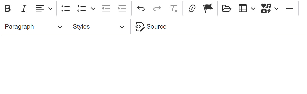
The Link button on the Text Editor toolbar can be used to create a link to a page, file, or email address.
- In the Text Editor, select the text you want to link.
- Click the Link button on the toolbar.
- In the Link URL field, enter the URL of the page you want to link to.
- Click the Save button .
 on the toolbar.
 .
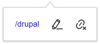
.NOTE: You can edit or remove a link by clicking the link text and selecting the desired option on the shortcut menu.
- In the Text Editor, select the text you want to link.
- Click the Link button on the toolbar.
- In the Link URL field, enter the URL of the file you want to link to.
- If you are linking to an external file (a file hosted on a different server), enter the full URL path.
- If you are linking to a file on Drupal, enter /sites/default/files/filename (replace filename with the name of your file). See the Manage Media section for instructions on how to upload a file to Drupal.
- Click the Save button .
- In the Text Editor, select the text you want to link.
- Click the Link button on the toolbar.
- In the Link URL field, enter mailto: followed by the email address (e.g., mailto:[email protected]).
- Click the Save button .
The Table button on the Text Editor toolbar can be used to add a data table. Tables should not be used for page layouts. To make tables accessible, make sure to designate column and/or row headers.
To add a table:
- In the Text Editor, click where you want to add the table.
- Click the Table button on the toolbar, move the cursor over the grid until you highlight the number of columns and rows you want, and then click to insert the table.
- To add content to the table, click in each cell and enter data.
- To designate column and/or row headers, click in the first cell of the table, and then do the following:
- To designate a header column, click the Column button on the shortcut menu, and turn the Header column toggle on.
- To designate a header row, click the Row button on the shortcut menu, and turn the Header row toggle on.
 on the toolbar, move the cursor over the grid until you highlight the number of columns and rows you want, and then click to insert the table.
 on the shortcut menu, and turn the Header column toggle on.
 on the shortcut menu, and turn the Header row toggle on.
NOTE: The shortcut menu that appears when you click in a table allows you to add or remove columns and rows, merge or split cells, toggle the caption on and off, and change the properties of individual cells or the entire table.
The Media button on the Text Editor toolbar can be used to add images to a page.
To add an image:
- In the Text Editor, click where you want to add the image.
- Click the Media button on the toolbar.
- In the Select media item to embed window, select your group folder in the left pane, select an image in the right pane, and then click the Select media button. In the Embed media item window, select the desired options, and then click the Embed button. If the image you want to add is not in your group folder, follow the steps in the Manage Media section to upload it.
 on the toolbar.
NOTE: You can edit the properties of an image by selecting it, and then clicking the Edit button on the shortcut menu. You can remove an image by selecting it, and then pressing the Delete key on the keyboard.
 on the shortcut menu. You can remove an image by selecting it, and then pressing the Delete key on the keyboard.
Design blocks can be used to add predesigned sections of content to a webpage. You can choose the design blocks you want to add and the order in which to place them. The design blocks that can be added will vary based on the content type. Visit the Demo site to view a sample of each design block.
Add a Design Block
There are various types of design blocks that can be added to a page. On the published page, design blocks will display below the main content.
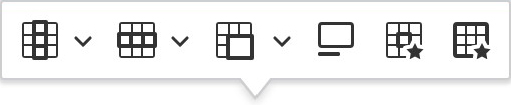
To add a design block:
- Go to the page where you want to add a design block and click the Edit tab.
- Click the Design Blocks tab.
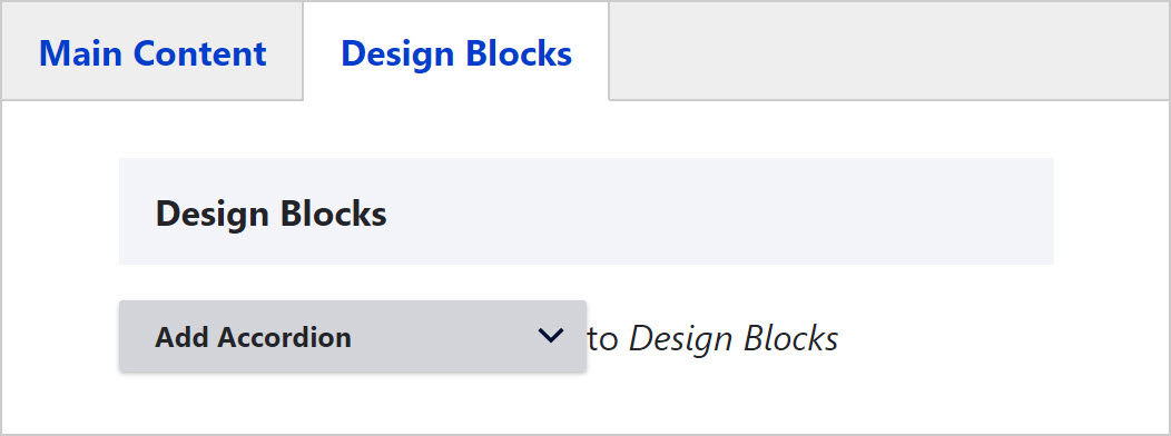
- Click the arrow on the Design Blocks drop-down list and select the design block you want to add.
- Enter content in the design block fields.
- Repeat steps 3 to 4 to add additional design blocks.
- When finished, select a moderation state, and then click the Save button.
Move a Design Block
You can move design blocks if you need to reorder the content on a page.
To move a design block:
- Go to the page that includes the design block you want to move and click the Edit tab.
- Click the Design Blocks tab.
- Locate the design block you want to move, and then drag the move icon up or down to move the design block to its new location.
- When finished, select a moderation state, and then click the Save button.
 up or down to move the design block to its new location.
Edit a Design Block
You can edit a design block if you need to update the content or settings.
To edit a design block:
- Go to the page that includes the design block you want to edit and click the Edit tab.
- Click the Design Blocks tab.
- Locate the design block you want to edit, and then click the Edit button.
- Expand Content or Settings, and make the desired changes.
- When finished, select a moderation state, and then click the Save button.
Remove a Design Block
When a design block is no longer needed, you can remove it from a page. Note that removing a design block will also delete all the content within it.
To remove a design block:
- Go to the page that includes the design block you want to remove and click the Edit tab.
- Click the Design Blocks tab.
- Locate the design block you want to remove, click the vertical ellipsis icon and select Remove from the menu.
- When finished, select a moderation state, and then click the Save button.
 and select Remove from the menu.
Below are step-by-step instructions on how to manage groups.
A website in Drupal is called a group. Each group contains all the members, menus, files, and pages associated with the group. To manage a group, navigate to it by clicking the group name on your profile page, and then use the tabs in the group to manage the content. The tabs that are available to you will depend on your group role.
- The View tab displays a summary of the group settings.
- The Media tab allows you to manage the files in a group.
- The Edit tab allows you to update group settings.
- The Revisions tab displays revisions for group settings.
- The Members tab allows you to manage the members in a group.
- The Nodes tab allows you to manage the pages in a group.
- The Moderated content tab displays pages that are in a draft or archived state.
- The Group menus tab allows you to manage the menus in a group.
Each member in a group has a role which defines their level of access to the group.
| Role | Permissions |
|---|---|
| Group Administrator |
|
| Group Publisher |
|
| Group Editor |
|
Add a Member
Group Administrators can add members to a group that they manage. The only information that is needed to complete the process is the person's username.
NOTE: If a person has never logged in to Drupal, their account is considered inactive. Before a person can be added to a group, they must first log in to Drupal to activate their account.
To add a member to a group:
- Click the group name on your profile page to navigate to the group.
- Click the Members tab.
- Click the Add member button.
- Enter the person’s username in the User field.
- Select a role from the Roles drop-down list.
- Click the Save button.
Change a Member's Role
Group Administrators can change a member’s role in a group that they manage.
To change a member's role:
- Click the group name on your profile page to navigate to the group.
- Click the Members tab.
- Locate the member whose role you want to change.
- In the Operations column, select Edit member from the drop-down list.
- Select the new role from the Roles drop-down list.
- Click the Save button.
Remove a Member
Group Administrators can remove members from a group that they manage.
To remove a member from a group:
- Click the group name on your profile page to navigate to the group.
- Click the Members tab.
- Locate the member you want to remove.
- In the Operations column, select Remove member from the drop-down list.
- Click the Delete button on the confirmation page.
Group Administrators can manage group menus. Depending on the content type, the group menu will appear as a horizontal menu below the banner or a vertical menu in the left sidebar. A group menu displays up to 2 levels of links. On mobile devices, a group menu renders as a menu bar and displays the menu title.
- Click the group name on your profile page to navigate to the group.
- Click the Group menus tab.
- Locate the menu you want to edit, and then click Edit in the Operations column.
- On the Edit menu page, click the Add link button.
- On the Add menu link page, enter the link text in the Menu link title field.
- Enter the link destination in the Link field.
- Enter or select any other link attributes as needed.
- Click the Save button.
- Click the group name on your profile page to navigate to the group.
- Click the Group menus tab.
- Locate the menu you want to edit, and then click Edit in the Operations column.
- On the Edit menu page, locate the link you want to edit and do one of the following:
- To update the link, click Edit in the Operations column, make the desired changes, and then click the Save button.
- To enable or disable the link, select or deselect the Enabled check box, and then click the Save button.
- To move the link, drag the move icon up or down to its new location, and then click the Save button.
- To make the link a child of another link, drag the move icon to the right so it indents beneath the parent, and then click the Save button.
- Click the group name on your profile page to navigate to the group.
- Click the Group menus tab.
- Locate the menu you want to edit, and then click Edit in the Operations column.
- On the Edit menu page, locate the link you want to delete, and then select Delete from the drop-down list in the Operations column.
- Click the Delete button on the confirmation page.
All group members can manage media in a group. This includes images, documents, and remote videos.
- Click the group name on your profile page to navigate to the group.
- Click the Media tab.
- Click the Create media button.
- Click Group media (Image).
- Click the Choose File button, locate and select the image you want to upload, and then click the Open button.
- Enter a short description of the image in the Alternative text field.
- Click the Save button.
NOTE: If you upload a file to Drupal that has a name that’s already in use within any website, then a number will be appended to the end of the file name based on how many other files have that same name (_0, _1, _2, etc.).
- Click the group name on your profile page to navigate to the group.
- Click the Media tab.
- Click the Create media button.
- Click Group media (Document).
- Click the Choose File button, locate and select the document you want to upload, and then click the Open button.
- Click the Save button.
NOTE: If you upload a file to Drupal that has a name that’s already in use within any website, then a number will be appended to the end of the file name based on how many other files have that same name (_0, _1, _2, etc.).
- Click the group name on your profile page to navigate to the group.
- Click the Media tab.
- Click the Create media button.
- Click Group media (Remote video).
- Enter the URL of the video you want to add in the Video URL field.
- Click the Save button.
- Click the group name on your profile page to navigate to the group.
- Click the Media tab.
- Locate the media you want to edit.
- In the Operations column, select Edit media.
- Make the desired changes.
- Click the Save button.
- Click the group name on your profile page to navigate to the group.
- Click the Media tab.
- Locate the media you want to delete.
- In the Operations column, select Delete media from the drop-down list.
- Click the Delete button on the confirmation page.
Group Administrators can add a banner image to a website. The banner image will be displayed on all pages, except for the landing page.
To add a group banner image:
- Click the group name on your profile page to navigate to the group.
- Click the Edit tab.
- Click Group Banner Image to expand it.
- For the Image and Mobile Image fields, click the Select media button, select your group folder in the left pane, select an image in the right pane, and then click the Select media button. If the image you want to add is not in your group folder, follow the steps in the Manage Media section to upload it.
- Click the Save button.
Group Administrators can add social media links to a website (Facebook, X (Twitter), Instagram, LinkedIn, and YouTube). Once added, the links will display as icons below the left sidebar menu. The icons will also appear in design blocks that include social media links.
To add a social media link:
- Click the group name on your profile page to navigate to the group.
- Click the Edit tab.
- Click Group Social Media to expand it.
- Enter your social media URL in its corresponding field.
- Click the Save button.
Group Administrators can enable a calendar for a website. The calendar lists events created with the Event content type.
To enable a group calendar:
- Click the group name on your profile page to navigate to the group.
- Click the Edit tab.
- Click Group Calendar to expand it.
- Select the Enable Group Calendar check box.
- Click the Save button.
Frequently Asked Questions
Each website has one or more Group Administrators who manage access to the site. You should contact a site's Group Administrator to request access. If you don't know who administers a site, you can ask the college or department, or you can email the Web Administrator.
A website (also called a group in Drupal) can only be deleted by the Web Administrator. If your website is no longer needed, please submit a support ticket and include the name and URL of the website you want deleted. Please note that when a website is deleted, all pages and media in the site will be deleted, so you should save any pages or files you need before submitting the ticket.
Every page in Drupal needs to have a unique URL and the URL is automatically generated based on the page title. If you create a new page in your group and give it the same title as an existing page, Drupal will append a hyphen and a number to the URL (-0, -1, -2, etc.). To prevent this, you should give each page a unique title.
If you change the title of a page and the URL doesn’t automatically change to reflect the new title, please submit a support ticket and we will enable the automatic URL setting on the page.
If you try to add a member to a group and get an error message stating that there are no matching users, it means that the user has never logged in to Drupal. Ask them to log in at www.calstatela.edu/login, and then you should be able to add them to the group.
If you try to save a page and get an error message stating that the background field is required or that the background value should not be null, it means that the background for one or more Image with Side Text design blocks is not set. Once you set a background, you should be able to save the page. For more information, visit the Image with Side Text Background Field page.