

Ensure that the foreground and background hues, along with other visual cues, exhibit sufficient contrast with each other.
Having a basic grasp of color and contrast can significantly enhance your ability to convey information effectively across documents, web content, and presentations. This knowledge isn't exclusive to graphic designers or artists; color stands as a potent yet frequently mishandled element in visual communication.
Impact
Simply because your documents and web pages appear a certain way to you during the design phase doesn't guarantee the same perception for your audience.
- Users of adaptive technologies like screen magnifiers can change the way colors look on their personal display by for example, enabling high contrast mode.
- Some users may be looking at your content while standing in bright sunlight.
- Some may have an older computer monitor with different color calibration settings.
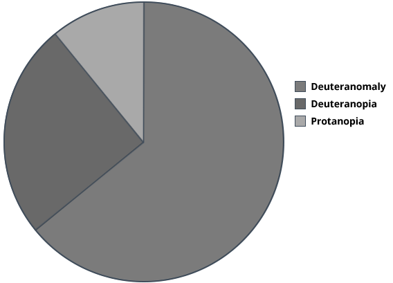
This is how a pie chart showing the prevalence of the top three types of color blindness using blue, pink, and green color coding may look to a person with color blindness
SOURCE: TYPES OF COLOR BLINDNESS (COLBLINDOR)
Both RGB and CMYK are modes for mixing color in graphic design. As a quick reference, the RGB (Red, Green and Blue) color mode is best for digital work, while CMYK (Cyan, Magenta, Yellow, Black) is used for printed materials.
While you can never control (or know) what your users see, you can follow these simple rules.
Relying solely on color to convey information is not advisable. For instance, if you color-code your document (e.g., "responses to your questions are highlighted in blue"), a portion of your readers may struggle to locate the pertinent information. Screen readers do not provide a method to search by color, and individuals with diverse conditions or in specific environments may also face challenges in discerning color differences.
This includes people who:
- Are color blind
- Have low vision
- Have age-related vision issues such as macular degeneration
- Use monitors with incorrect or imperfect color rendering
- Are trying to read your materials on their phone while standing in broad daylight
Do
Use color plus another element to emphasize a point or visually distinguish information differences:
- Bold
- Size
- Patterns or shapes
- Halo (highlights)
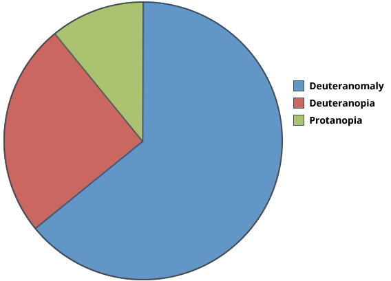
Pie chart showing the prevalence of the top three types of color blindness: deuteranomaly more than half, deuteranopia about a third, and protoanopia the least prevalent (source: http://www.color-blindness.com/2010/03/09/types-of-color-blindness)
Source: Types of Color Blindness
Don't use color alone to emphasize a point or show information differences.
Don't use color plus underline to show emphasis (it looks like a hyperlink).
Don't use color plus italics to show emphasis (it is difficult to read in large amounts).
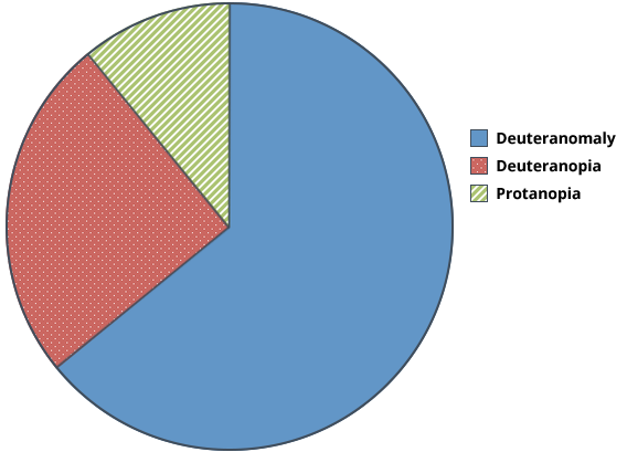
Pie chart showing the prevalence of the top three types of color blindness: deuteranomaly, colored blue, is more than half; deuteranopia, colored pink, is about a third; and protoanopia, colored green, is the least prevalent
Source: Types of Color Blindness
Color contrast is measured as a ratio of brightness to darkness, the brightness of a color against the darkness of the color it appears on top of. WCAG 2.1 guidelines specify different contrast ratios depending on the size and weight of the font text, such as:
- 3:1 for large text (14-point or larger bold or 18-point or larger non-bold) and graphics and user interface components
- 4.5:1 for normal text (less than 14 points)
Do
If you’re not sure whether your background and foreground colors have adequate contrast, you can compare the two colors using a color accessibility checker, such as the webaim.org color contrast checker. You’ll need to know the hexadecimal value of the colors in order to perform this check.
Do Example
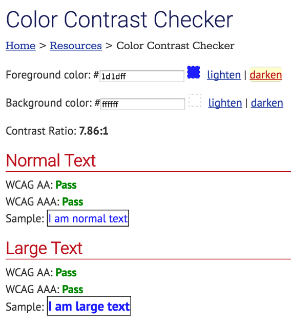
This screenshot shows the webaim.org color contrast checker comparing two colors (pure blue text on pure white background) that conform to the WCAG 2.0 color contrast guidelines at all levels and text sizes, because the contrast ratio is greater than 7 to 1
Source: Contrast Checker (WebAIM)
Don't
Don't use background and foreground colors that don't pass WCAG 2.0 guidelines.
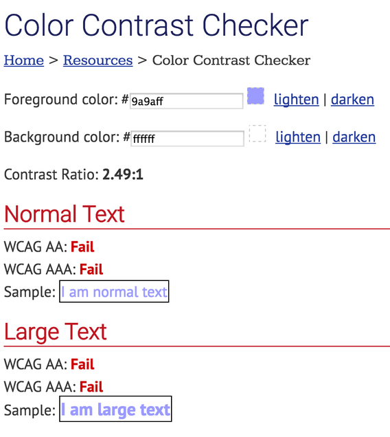
This screenshot shows the webaim.org color contrast checker comparing two colors (lavender text on pure white background) that fail the WCAG 2.0 color contrast guidelines at all levels and text sizes, because the contrast ratio is less than 3 to 1
Source: Contrast Checker
(WebAIM)
How-to
- WebAIM's color contrast checker
- Colorzilla
- Colour Contrast Analyser
- Understanding minimum contrast
- Colors with Good Contrast from the Web Accessibility Initiative
- Low-contrast text
- Color modes