LIMITED-USE LOGOS
All Cal State LA logos for colleges, divisions and offices, as well as institutes, initiatives, centers and programs connected to the University are approved and created by the Office of Communications and Public Affairs. All requests for an alternate logo must be sent to the office, which will create the new logo if approved.
All Cal State LA logos are only for the official use of University divisions, colleges, departments, offices, centers and institutes.
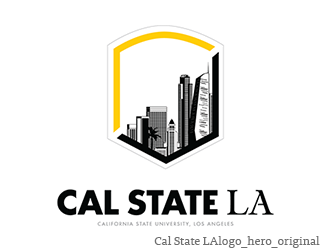
The Cal State LA logo was developed to reflect the strengths of the University and its advantageous location in the City of Los Angeles. Nicknamed the “Hero Logo,” this mark is intended for use in communications and publications that represent the University as a whole, including but not limited to events, brochures, PowerPoints, presentations, email blasts, notepads and more.
All uses of the Hero Logo and Shield must be approved by the Office of Communications and Public Affairs.
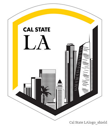
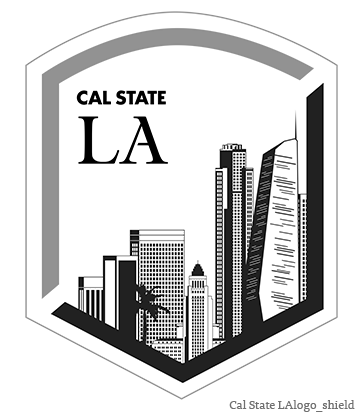
The Shield option adds the customized Cal State LA typography inside the border while maintaining the skyline graphic. This option is available in two styles: full-color with a white background or black-and-white.
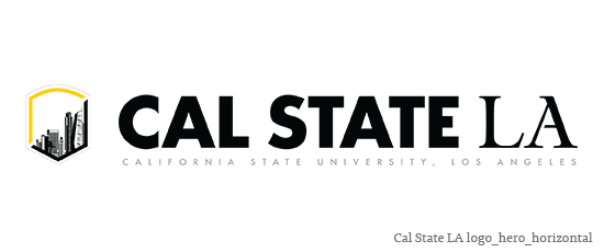
The Hero Logo can be expressed in two treatments: Hero Logo Original and Horizontal. Hero Original is the preferred treatment, but the horizontal option exists to allow for versatility in application. When budget, printing restrictions, or design needs prevent the use of full color, the one-color black version is acceptable.
HERO LOGO
SHIELD
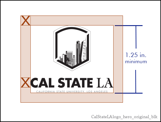
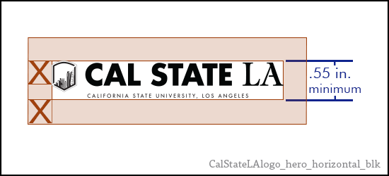
SIZE AND CLEAR SPACE
Sizing and clear space suggestions for the logos provide guidance on how to place the logo in your communication projects. Many variables will determine how you will use the logo. In most instances the logo should appear as an “approved signature.” It should also be seen clearly but does not need to be the focal point. Headlines, text, photography, and media platform all play a factor in how and where the logo will appear.
Clear space is the area surrounding the logo that must be kept free of competing text or graphic elements. Leaving space around the logo ensures that it will stand out appropriately and that other words and graphics will not appear attached to the logo.
The examples at right show minimum heights (in dark blue) and clear space (in maroon) for the Hero logos.
BACKGROUND
For our new brand to have the most impact, the logo must always be legible. The key to selecting the right background is maximum readability. If it’s too difficult to read the typeface or recognize the logo, you should consider using a different background or adjusting the design so that the logo stands out with proper clear space. The following examples show unacceptable usage of the logo on various backgrounds.
| GETTING IT RIGHT |
|---|
|
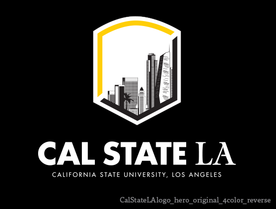
When using the Hero Logo on a dark background, it’s OK to reverse the text only to white for maximum readability.
|
Do not use the logo on complex textures.
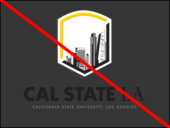
Do not use the logo on backgrounds that
do not provide adequate contrast.
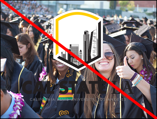
Do not use the logo over busy still
photography.
INCORRECT USAGE
Maintaining the integrity of the Cal State LA logo is important to building a strong identity. The logo must be presented in a consistent and legible manner. Do not alter the logo in any way by changing or adding elements or using only portions of it.
| GETTING IT RIGHT |
|---|
|
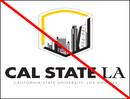
Do not stretch, squeeze or alter the
proportions of the logo.
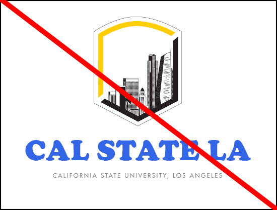
Do not customize the Cal State LA
typography. Do not change the fonts
or the colors.
Do not add special effects, such as
drop shadows, filters, textures or
transparency.
Do not realign the shield to the
typography, it must always appear
centered above the typography.
Do not tilt or rotate the logo.
Do not create new logos, remove the
cityscape or customize the shield’s
interior by adding to or altering its contents.
Do not reverse the colors of the skyline.
It should always be black buildings on
a white background.
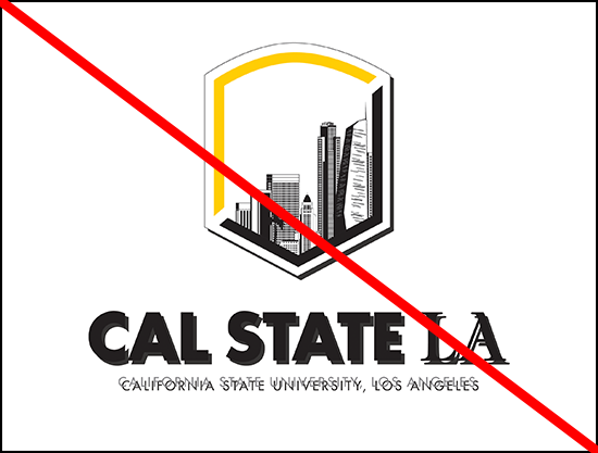
Do not use scanned or low-quality
images of the logo. Use the original files.
Do not use the logo as a word in
sentence case.